Friday, 16 October 2015

Mad Max Aanlysis

Mad max film opening

In the film opening, it focusing on the intimacy of the protagonist. This is something that in my film opening I want to follow, it provides great effect and engages the audience. The cinematography would be difficult to replicate as it is done to high quality however we can , however the intimacy of the main character (protagonist) is definitely  something I'd want to follow. Overall the film opening is a great representation of an action film, and helped me to devise my idea.

Thursday, 15 October 2015

District 13 Analysis

District 13 Parkour Scene

I also looked at District 13 when contrasting my idea. It again follows the general convention of action film openings whereby the antagonist is chasing the protagonist over a physical object, in this case, drugs. This is a more extreme version of parkour, something which would be difficult for us to replica but in relation to the editing, it is possible for us to edit in a similar way, fast paced editing and short clips, along with consistency of light. Overall the parkour scene in District 13 was very effective in helping me decide on the sort of pace I wanted to achieve in the film opening, using this alongside other action films helped to contrast the overall idea, including Casino Royale.

Wednesday, 14 October 2015

Casino Royale Analysis

Casino Royale Parkour Chase Scene (2006)


Initially, when I was creating my presentation / pitch, I looked at the Casino Royale opening and used it during my pitch. The idea behind it, with the antagonist chasing the protagonist over a package, and the protagonist getting away with the package after a 'bust up' was something I want to simulate. In terms of shots, in Casino Royale they use fast paced editing with a lot of shots and a variation of camera angles. One type off shot is first person, which is used on various occasions throughout thought the opening during the chase, this is something I would like to do and I can achieve this from the use of Go-Pros available to me at school. Overall, this film opening provided a lot of inspiration for me when devising the opening I wanted construct.


Tuesday, 13 October 2015

Le Donk and Scor-zay-zee Analysis

Opening of "Le Donk & Scor-Zay-Zee"

Le Donk & Scor-zay-zee

(Shane Meadows, 2009)

Produced by Big Arty Productions and Warp Films
Budget £48,000 (estimated)
Rock roadie, Le Donk, has lived, loved and learned. Along the way, he's lost a classy girlfriend but gained a sidekick, Scorz-Ayz-Ee. He sets out to make Scorz a star with a little help from the Artic Monkeys.[Source IMDB]


Shot By Shot Break Down
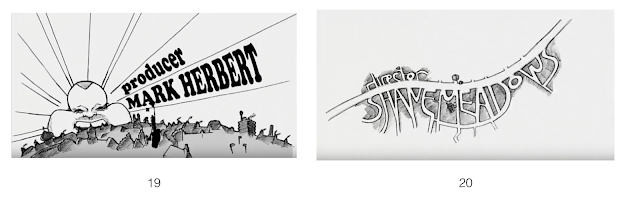
Overall, the opening sequence is about 2.5 minutes long, and includes 21 overall titles that last for 1:40 minutes and the first shots before the titles lasting for 55 seconds.
The film seems to be trying for verisimilitude, as it doesn't start with a montage and non-diegetic sound, but with a long-shot of one of the main characters. There isn't much of a narrative enigma, but this works as it fits with the characters (who seem rather unintelligent) and are rather unsubtle.


  • This is the first shot of the film. There are no titles - it simply cuts in with a close up shot of the sign on the caravan and then zooms out to reveal the whole caravan (that shifts ever so slightly) of one of the characters in the middle third. All the sound is diegetic. It can be denoted that the character looks what you would call 'chavy' or quite Americanised, he is wearing an American football jersey and red jogging bottoms: this exposes to us that the character is extremely influenced by America, and given that the audience is likely to also be very influenced by America they are likely immediately relate to the character. A narrative enigma is created briefly as an audience wonders what he is going to say and what's going to happen next. The lack of titles seems to have been done to create a strong sense of verisimilitude (as this is a sort a music video)


  • The music video style of the whole opening denotes that the film will have some sort of music theme to it the is also shown in the opening titles were the almost documentary 'behind the scene' style filming turns into a cartoon.


  • This could also connote the childish nature of the film which charts the character almost growing up in the music world.

Opening Credits (in order)


21


  • The next shot after the cartoon aspect of the film if a shot of a run-down street the immediately suggests the social class of the characters of the film as working class or poor this is due to the run down nature of the neighbour hood and the cars (a big telling factor in when making assumptions with films) this also ties in with the opening shots as before the titles start which shows the to characters exiting a 'run down' caravan (as can been seen in the start of the blog post).


  • After that shot the door in front of the camera opens and when are presented with the main character who tries to be funny in a childish sense. This immediately presents the character as fun and the film as a fun film/ comedy instead of a serious documentary as appose to the documentary style it is in.

About a Boy Analysis

About A Boy Opening

About a Boy (2007)

Producing - Working Title Distribution - Universal

Budget - $30m

Box Office - $130m (World) $41m (USA)


Cinematic release in 51 separate countries

Production Companies

20 seconds

10 seconds

10 seconds


Idents
  • 3 company idents in the centre of the shot
  • Universal Studios, Studio Canal and Working Title
Titles
  • 2 production company's titles, centre shot, white on black - connotes a professional film
  • Font connotes that the film is a comedy

  •  The producers of the film
  • Does not obey rule of thirds, names are in the right third of the shot
  • Audio bridge with diegetic sound

Opening Shot

  •  Diegetic sound from the TV
  •  Chris Tarrant Who Wants To Be A Millionaire - achieving verisimilitude
  • medium shot


  •  Large book denotes that the character reads books, this is stereotypically middle class
  • The book juxtaposes with the opened can of RedBull and signifies the film will not be stereotypically middle class


  • The title of the film does not have any upper-case lettering, this connotes that the film is targeted at youth. 


  • Tracking shot


  • The opening is using narrative enigma by not showing the face of the protagonist
  • However, the opening is also showing a lot of the house giving the audience an idea of the class of the protagonist


  • Each take ranges from 4-25 seconds in length
  • No regularity in editing


  •  Non-diagetic voice over
  • Voice of the character on screen


  • 34 total names used in the title sequence
  • 8 scene set-ups in the title sequence

  •  Establishing shot is a two shot with the protagonist and another character
  • This denotes that these two characters will be connected later on in the film

  • Ninth scene set-up of the opening
  • Shot reverse shot


  •  Breaks shot reverse shot pattern
  • The house is a stereotypical middle class british house
  • In contrast, the house is cluttered, which signifies and gives anchoragethat the film will not be the stereotypical middle class british film


  • Master shot of the room
  • Long shot

1st Shot

  • Long shot 
  • Cross fade transition from opening sequence to main body of the film
Running time of opening - 5:41
Length of idents - 40 seconds
Time between idents and opening shot - 5:01

Pretty in Pink Film Analysis

Opening EGs: Pretty in Pink (Deutch, 1986) 

Image from clothing shop promo, 2013

Pretty in Pink 
, 1986
Paramount Pictures (prod. AND distrib.)

Budget: $9m; US box office: $40.5m

Opening duration: 2:30/4:41*
RottenTomatoes.com 81%; IMDB 6.6 ; Roger Ebert 4*.

*Scene in house up to 2:57; title theme comes in and out 'til 4:41


SUMMARY/IDEAS I MIGHT USE:
[its useful to pick out ideas/elements you might use] An opening of contrasts: grim mise-en-scene, but straight into the rom-com love triangle narrative. Surprisingly plain sans-serif titles and downbeat title theme song. Front-loaded with titles. Interesting gender representation: is Ringwald stereotype, countertype or a complex mix of both?


SYNOPSIS:
Classic teen rom-com penned by 80s master John Hughes, with a love triangle centred on class identity; the female lead (Ringwald) is from a poor (in US cinema terms!!!) single parent household. Fiercely independent, she makes her own clothes, but is mocked by richer cheerleader types. Low budget but a sizeable hit, and continues to sell well today (long tail theory?!).
A vertically integrated conglomerate

IDENTS/TITLES:
[I use this example in the titles/idents vodcast
Just 1 ident: this was an example of partial vertical integration, with 'big 6conglomerate Paramount handling production and distribution.
The titles begin with (1) Paramount Pictures presents (2) a John Hughes Production. Hughes had already made his name, and was a big draw worth emphasizing; while the auteur theory typically credits the director with authorship, this was a Hughes film, not the rather anonymous Deutch.
Hughes is the real big name here

The title might suggest a feminine, swirly (handwriting style) serif font ... but instead we get this fairly plain, sans-serif font. We can also denote the white on black background. Taken together, these choices signify realism ... which the gritty, (sub)urban mise-en-scene of the opening shots further reinforces, or anchors. However ... the font style is similar to that associated with 1920s era glamour (see Corbert font screenshot below); these conflicting connotationsarguably reflect the hybrid nature of rom-com well.

We only get these two title frames before the action begins. Further titles appear over action shots, in this order and (generally upper) case; they each fade out after about 3secs:
PRETTY IN PINK [centred]
STARRING MOLLY RINGWALD [we cut on screen to shot of her putting on tights]
HARRY DEAN STANTON [these 2 are centred; the lesser 'stars' below are bottom-right]
Roles are in reduced font size; 2 names split over 2 lines
JON CRYER 
ANNIE POTT
JAMES SPADER
AND ANDREW McCARTHY ['and' smaller font, as with DVD/poster billing block] 
CO-STARRING JIM HAYNIE
ALEXA KENIN 
KATE VERNON [its noticeable that these names fade out quicker] 
MUSIC SCORE COMPOSED BYMICHAEL GORE
CASTING BY PAULA HEROD AND MARCI LIROFF [split over 2 lines]
I googled '1920s font'; this is 1 egsim to titles?

COSTUME DESIGNER MARILYN VANCE
EDITED BY RICHARD MARKS
PRODUCTION DESIGNER JOHN W. CORSO
DIRECTOR OF PHOTOGRAPHY TAK FUJIMOTO
EXECUTIVE PRODUCERS JOHN HUGHES AND MICHAEL CINICH [again, split over 2 lines]
WRITTEN BY JOHN HUGHES
PRODUCED BY LAUREN SHULER
DIRECTED BY HOWARD DEUTCH [film time: 2:57]
'Crossing the tracks': class conflict is central
If this was released today would we see quite so many credits front-loaded? Equally, we expect today to see more company credits and idents!
As the title theme fades in and out but doesn't actually end until 4:41, when we cut to a classroom, its arguable whether the end of the titles or the end of the title music denotes the end of the opening sequence.

MISE-EN-SCENE:
Not the opening image the title leads us to expect?!
Finally some colour! Mise-en-scene binary/juxtaposition 
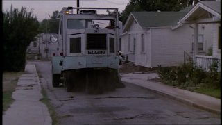
The opening shot is surprising, given the title: a road-sweeping vehicle, tracked along a cracked road where weeds grow along the edge of the paving, the gardens are overgrown, and the cars that eventually come into view are old (even for the time of release), all providing connotations of this as a working-class neighbourhood. This reading is backed up by the 2nd shot (which we cross-fade into): opening on a chain-link fence around a tarmac backlot (again overgrown with weeds, also barb-wire topped), we cross tracks (a common cliche itself for class divides, as we'll see in this narrative).
The one dash of colour we get is the pink car, finally revealed as the roadsweeper trundles out of frame.
The girl's bedroom is signified by a series of abstracted shots of clothing, jewellry etc.
The father's bedroom is untidy, and we enter this with the curtains closed, both successfully connoting his frame of mind. His unruly hair and not-quite clean-shaven reinforce this impression. A particular nice touch is what appears to be a framed photo of the absent mother on the bedside drawers.
Once we cut to the high school, we get simple but crucial props for verismilitude: the high school sign itself is visible; we see both the classic yellow school bus and scooters denoting older students parked up outside; we track Ringwald as she approaches her school locker, another classic signifier of school.
Clothing codes quickly emerge as important plot points: Ringwald is set up in binary opposition to welathier cheerleader types who explicitly mock her clothing, while Ducky's outrageous ensemble also forms a binary with his suave, 'posh' love rival who wears more mature 'country club' clothing. 

Nice hats...their binary opposites wear 'mature' clothing.
REPRESENTATIONS:
The absences are fairly routine, but still worth highlighting: homosexual or disabled characters, with the main cast all caucasian. Remember, the constant repetition of 'able-bodied', caucasian, heterosexual etc creates a normative effect, though we do get an interesting mix of stereotypes and countertypes here, not least with the unusual single-parent family.
Representations of age, gender and social class are all notable.

Like his female counterpart, preppy/country club style
AGE: Ducky is a classic stereotype of teens: loud and brash in manner as well as in clothing. However, his love rival dresses in a mature, even 'fogeyish' style. Ducky's rolled-up sleeves and badges could be read as a deconstruction of this, so perhaps not such a basic steretype after all? Similarly Ringwald and her cheerleader-type social rival form a binary, with Ringwald's costume bright and garish, flower-patterned black waistcoat over a pink blouse with a thick woolly pink cardigan while the tokenistic wealthy blonde rival has a smart lemon dress (and big 80s hairsprayed hair!).
Cynical male gaze?
Who the adult is in the Ringwald/father relationship is questionable: its she that tries to get him up and motivated in the morning! 

SOCIAL CLASS: Ducky and Ringwald are from one side of the tracks, while we got the wealthy opposites. Clothing codes, with the working-class characters more easily associated with youth, are key, but the opening quickly established that the working-class characters are outsiders.

GENDER: Again we see basic stereotypes which are revealed as a little more nuanced upon examination. Ringwald is revealed in a series of abstracted shots revealing body parts and her picking out clothing and jewellry - male gaze, right? This is no bimbo, however; fiercely independent and intelligent, her clothes are self-made, and her intelligence is signified by the simple prop of specs (which she puts on in the classroom)! 
Would this movie pass the Bechdel test?!

NARRATIVE, GENRE, EXPOSITION:
An unexpected role reversal (BUT gender stereotype?)
We find out about Ringwald's single-parent, working-class family background, her close relationship with Ducky - and their mutual low standing in the high school social circles. Their older-teen age is well 
Ducky gets handbagged + ends up ridiculed on the floor
established. We learn little about the two wealthier characters who will emerge as central, bar their fakeness and high social standing. McCarthy's lingering look after Ringwald (we get an eyeline match) clearly connotes the central disruption of the narrative, their on-off romance, disrupting the equilibrium of her/Ducky's relationship, with a 4th character (the sarky blonde) signified as an additional element to this love triangle.

Rom-coms typically feature a humiliated, emasculated male as part of a love triangle, and Ducky fits that role, ending up on the floor having been handbagged. As is most commonly the case, the character we literally follow and thus are encouraged to identify with is female.
The gritty mise-en-scene and the downbeat title track are countertypical, however, signalling that this might be a cut above the standard rom-com.
In the space of 4mins the basis of the film is well established.

SOUNDTRACK:
To funk: Enter the Ducky...who ain't gonna get lucky!

A little bit unsual: the title theme comes in from the 1st shot, but fades in and out, eventually ending nearly 5mins later. The initial fade out is nicely edited to emphasize Ringwald's diegetic calling out for her father - her voice rising as she tries for a response.
When Ducky 1st appears we get a short burst of an 80s funk track, with a low bass sound ... swiftly fading out as the response to him hardly anchors a reading of Ducky as cool, macho man!

If you want to see for yourself, here's a montage someone put together:

A ropey VHS transfer of the 1st 40secs:

The trailer:


Source: http://asmediafilmopening.blogspot.co.uk/2013/10/opening-egs-pretty-in-pink-deutch-1986.html